Posts

New and Improved Color Palette!

You know those things that, once they occur to you, seem glaringly obvious? The issue with the color palette I’ve been using for the design of the Cultus cards is one of those things. The problem is, I fell in love with a palette. It was bright, pretty, cheerful and modern. It looked great on the geometric forms in the game. The glaring problem with this is, of course, that the game takes place in a post-apocalyptic world that is neither bright, cheery nor modern. Duh.

So the card icons got a makeover! I figured it’s the least they deserve, after such a long hectic weekend at Boston FIG. You’ve got to treat yourself!

color_palette_preview

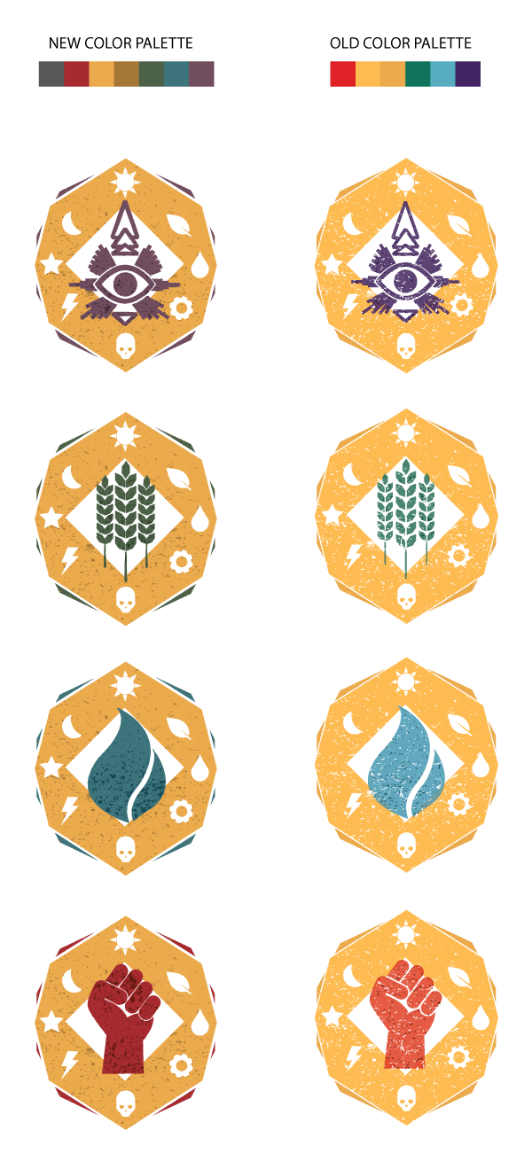
A liiiiittle bit of texture was also added to all the outlines so they wouldn’t look so straight and perfect. A little hard to detect on such a small size, but I think it’s enough to give it some oomph.

Now time for a relic makeover!

Influence Card Art

An art post has been a long time coming – so here’s a peek into what I’ve been working on lately.

There’s a lot going on in the world of our game, but I like to keep the art a little more on the simple side. To fit our theme, I felt we should add a lot of texture to the cards, and keep the images rather simple but colorful, and full of symbolism.

The cards below are all for the influence pile. All the idea cards fall into the categories of “Favor,” “Faith” or “Zealotry.” Since there will be a lot of idea cards, we’re going to use a consistent background for each to quickly visually identify that it is an idea card, and then vary the symbol used in the center of the card to quickly determine which category the idea falls into.

Favor:
favor

Faith:
faith

Zealotry:
zealotry

Another card that will share the same visual characteristics of the above three is the prophecy card. This symbol was a lot of fun to create – I drew on traditional symbolism used to represent a prophecy, as well as native imagery such as the Nazca Lines.

Prophecy:
prophecy

I’d like to work on the texture a bit more – it’s a challenge to create a texture that’s visible on a small image.

Most of the icons I used came from The Noun Project. This is a fantastic resource for icons of virtually any noun you can think of. In the future I’d like to customize our symbols a little more, but The Noun Project was a great resource that helped me pull this together quicker than if I had created each icon myself. Perfect for getting great art ready for future play-tests!

Influence Mechanic Video

Here’s another mechanics video. Hopefully the quality is a bit better this time around.

[youtube=http://youtu.be/15NBm7kSmnk]

Post a comment if you have any questions or feedback!