Revamped Designs Means Revamped Cards!

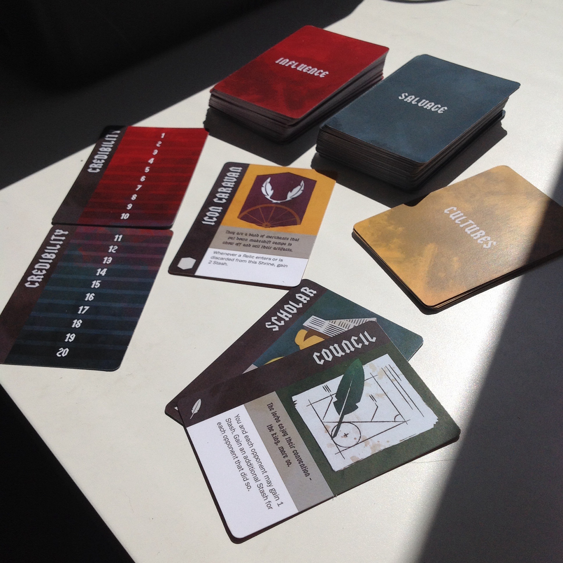
We’ve been working on major changes to the game in the months since our last post. Phil made great strides on the mechanics from playtests. His updates meant there was a need for new changes in the card design, and Cindy delivered. Here is a preview of the new deck design.

RevampCard1

The most important changes come from Phil’s removal of a lot of components from the previous prototype. There were a lot of things on the left sidebar that are gone now, and as Cindy said, ” less complexity is always a good thing.”

The deck is neatly divided by the colors of the back of the cards. The backgrounds and back of cards all have a weathered aesthetic to fit the theme and Cindy’s art.

RevampCard2

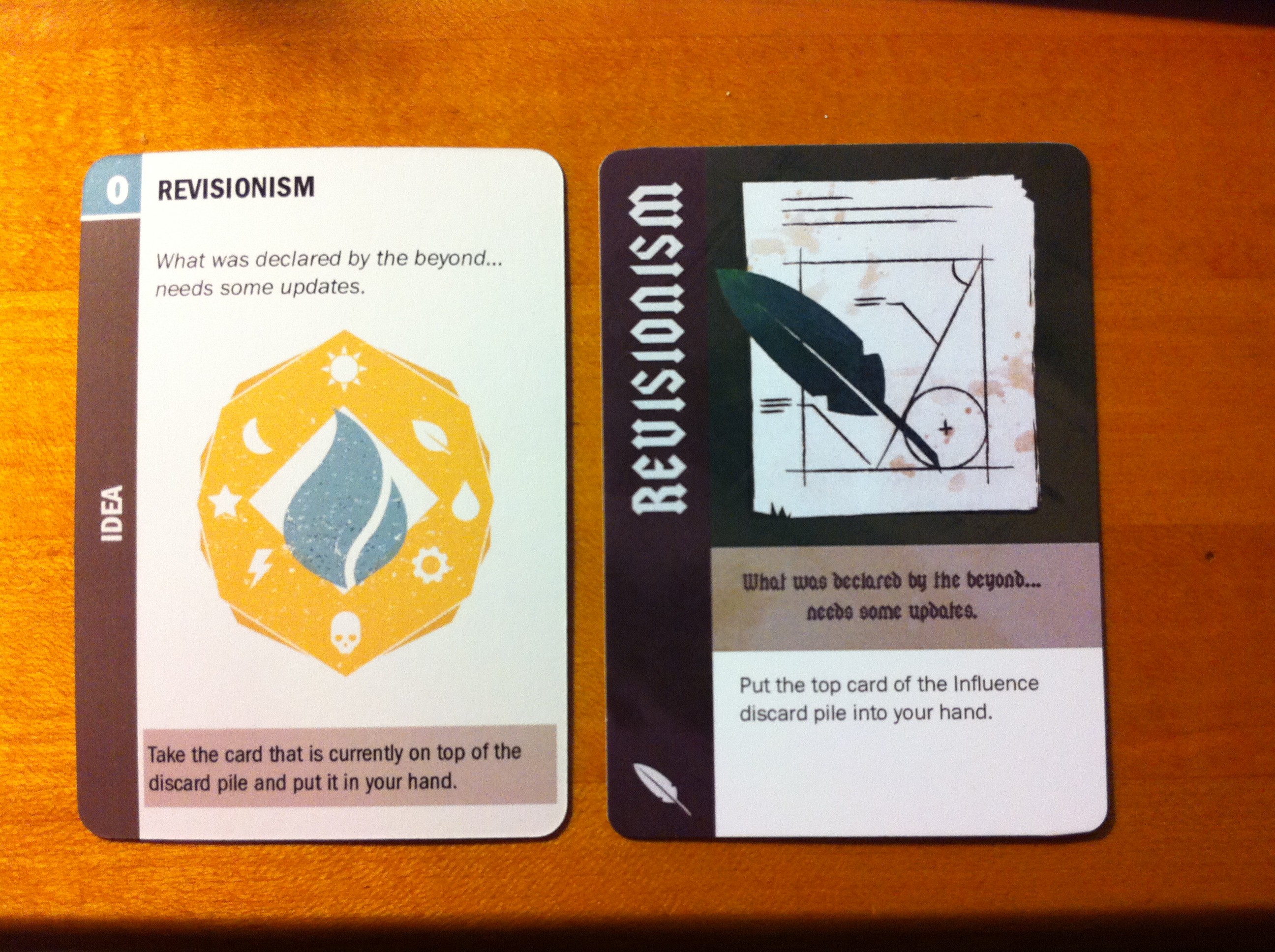
Here is the before and after of one of the Influence Cards, Revisionism. You can see the changes in font, icons, background color, and size of the text boxes. The overall dark tone of the new card helps push the dirty look we are looking for. It works great with the Follower and Shrine cards.

While they’re not include in these photos, I had some updates of my own. Since the design changes also affected the Culture cards, I made sure that those made sense thematically. Those were rewritten as well. Stadium, one of the Shrines, also needed a flavor text change since Phil made extensive switches on it. I also fixed the title of a Relic that’s been bothering me since I got on this project.

There’s the matter of one more major change left. The three of us would like to change the name of the game – the more we’ve pitched the game to others the more we’ve come to the conclusion there’s a better name we can use. When the time comes, we will release that as well. Hope you enjoyed the update!

New and Improved Color Palette!

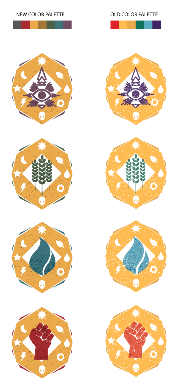
You know those things that, once they occur to you, seem glaringly obvious? The issue with the color palette I’ve been using for the design of the Cultus cards is one of those things. The problem is, I fell in love with a palette. It was bright, pretty, cheerful and modern. It looked great on the geometric forms in the game. The glaring problem with this is, of course, that the game takes place in a post-apocalyptic world that is neither bright, cheery nor modern. Duh.

So the card icons got a makeover! I figured it’s the least they deserve, after such a long hectic weekend at Boston FIG. You’ve got to treat yourself!

color_palette_preview

A liiiiittle bit of texture was also added to all the outlines so they wouldn’t look so straight and perfect. A little hard to detect on such a small size, but I think it’s enough to give it some oomph.

Now time for a relic makeover!

Unearthed Relics

Our great artist Cindy has been hard at work the relics.  In my opinion, this is part of the game that really cements the themes and world. As mentioned in my first post, the idea is to make these seemingly normal items into something you would put on a pedestal. With that in mind, I present to you the first one, the Earth Grinder:

“An unorthodox sword to fight greedy earth spirits”

RELIC-Earth_Grinder

This was one of the first Phil came up with. It is one of the Faith (general utility) cards. When sacrificed, it allows the player to draw more cards. I chose the name  to continue on the narrative of how the loss of information has made words as simple as “shovel” disappear.

Next one up is the Enduring Confection:

“Sweet ecstasy from the World Before attracts the hungry”

RELIC-Enduring_Confection

This is one of our Zealotry (attack-based) cards. When sacrificed, a player can steal a follower or missionary from another player. This one actually came from a friend of mine. I wanted to make an “edible” relic, and he was the one that suggested a Twinkie-like pastry (personally, I think they taste bland as hell).

We’ll put up more as the art progresses.

Influence Card Art

An art post has been a long time coming – so here’s a peek into what I’ve been working on lately.

There’s a lot going on in the world of our game, but I like to keep the art a little more on the simple side. To fit our theme, I felt we should add a lot of texture to the cards, and keep the images rather simple but colorful, and full of symbolism.

The cards below are all for the influence pile. All the idea cards fall into the categories of “Favor,” “Faith” or “Zealotry.” Since there will be a lot of idea cards, we’re going to use a consistent background for each to quickly visually identify that it is an idea card, and then vary the symbol used in the center of the card to quickly determine which category the idea falls into.

Favor:
favor

Faith:
faith

Zealotry:
zealotry

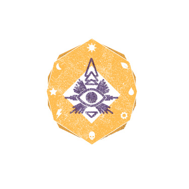
Another card that will share the same visual characteristics of the above three is the prophecy card. This symbol was a lot of fun to create – I drew on traditional symbolism used to represent a prophecy, as well as native imagery such as the Nazca Lines.

Prophecy:
prophecy

I’d like to work on the texture a bit more – it’s a challenge to create a texture that’s visible on a small image.

Most of the icons I used came from The Noun Project. This is a fantastic resource for icons of virtually any noun you can think of. In the future I’d like to customize our symbols a little more, but The Noun Project was a great resource that helped me pull this together quicker than if I had created each icon myself. Perfect for getting great art ready for future play-tests!

Playtest Meetup

Born from a desire to get some more playtesters for the game and to network with other game designers, I started a Meetup group: http://www.meetup.com/NYC-Tabletop-Game-Designers/. The idea is that designers can bring their prototypes, help test other people’s games, and get theirs tested as well. And even if you aren’t working on anything currently, you can still go to meet other designers and maybe get inspired.

Prototypes

Prototypes

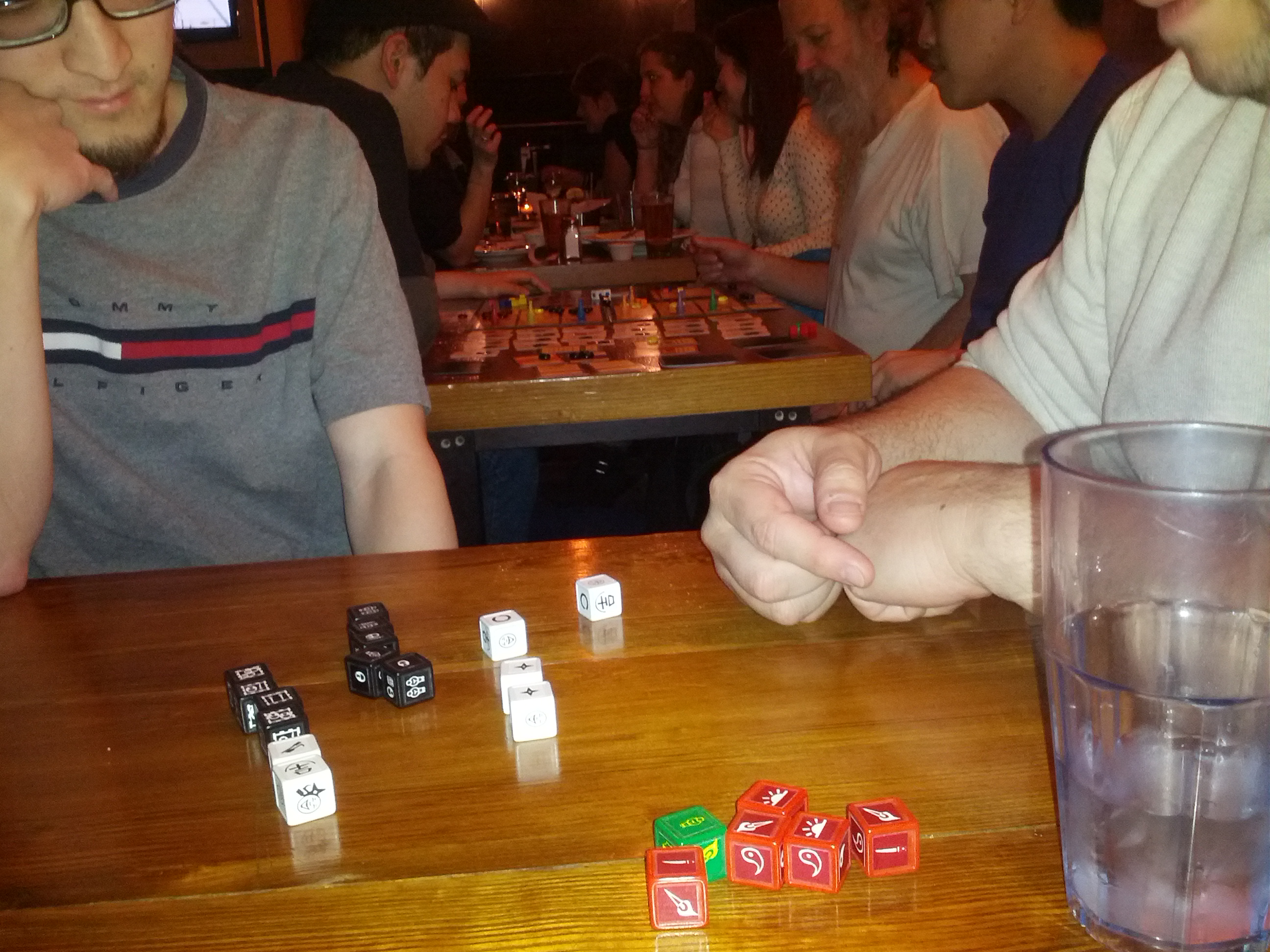
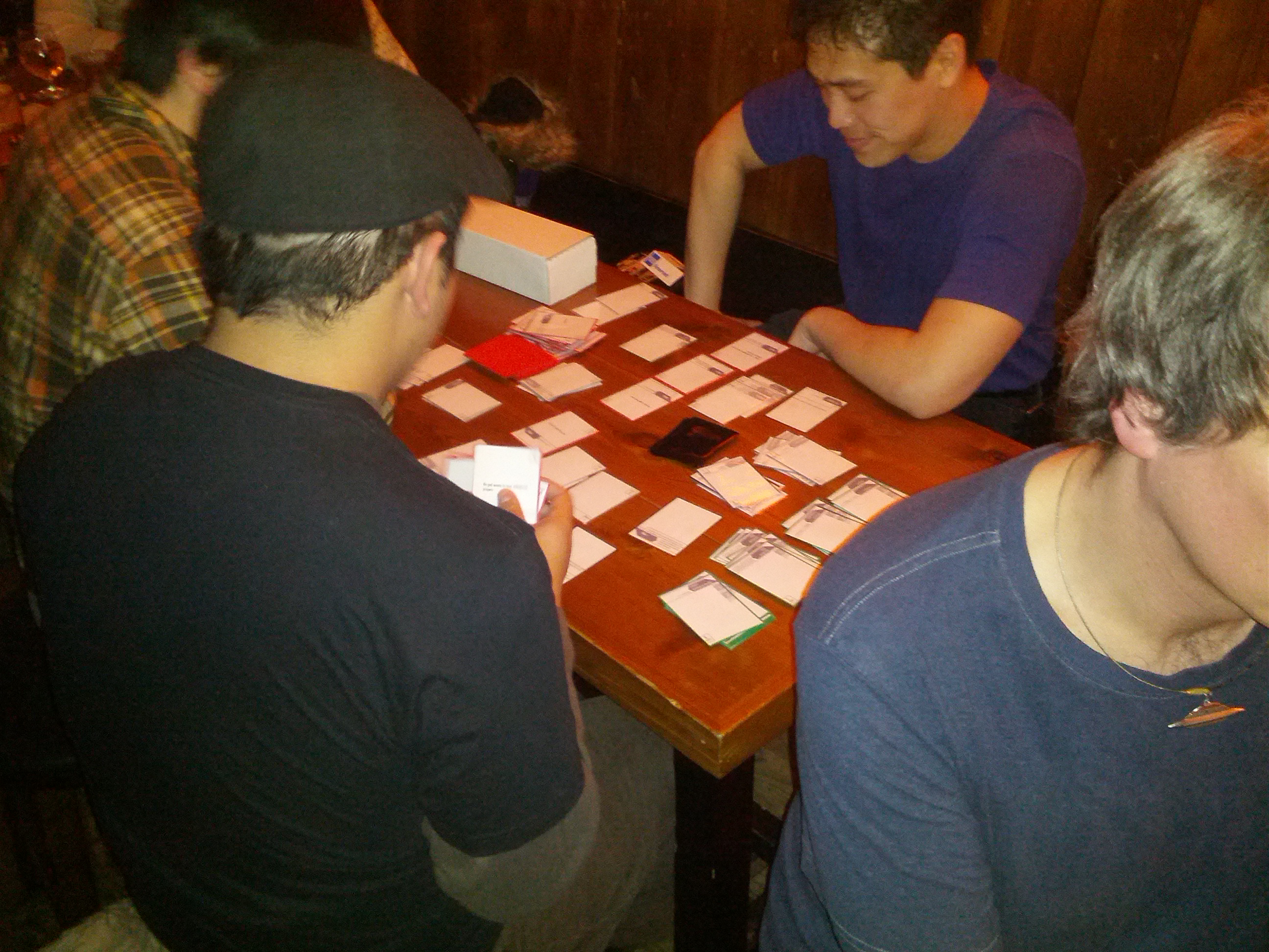
We had our first session on Tuesday (2/19/13). There were 4 prototypes to test, including our own, in various states of polish. The 2 games that I played were really fun and I’m looking forward to playing the other. The people that came were great, too. There was a lot of great feedback and ideas flying around.

Jesus running our game.

Jesus running our game.

Jesus ran our game and said that it was well received. The players seemed engaged and caught on quickly. They also gave us some really great feedback.

We’ve always struggled to keep the game going at a good pace and keeping turn length down. There have been some mechanics changes to help with that, such as having players draw their cards at the end of their turn. Our playtesters suggested that we could use the card aesthetics to help speed up the player’s analysis of the cards. As a result of that feedback, we are going to try putting icons on the Influence cards to indicate what “category” the card is in. Example categories could be attack, defense, or economy. This will help players quickly understand the purpose of a card and if they want to use it during their next turn.

The playtesters also suggested that the discard mechanic was counterproductive to keeping turns quick. Players may have spent time figuring out how their turn was going to go, but when they are forced to discard they will likely need to re-plan. On top of being frustrating, this ends up slowing down the game. We could also get into the even worse situation, were as a result of having to discard, a player has no options during their turn. Our playtesters suggested a possible solution to help deal with this problem. Instead of having a player discard a card, they receive a mark. This mark indicates that they will draw less cards at the end of their next turn, rather than discard immediately. The benefit here is that the victim is not forced to re-plan. The mark also sets expectations. Rather than planning a huge turn only to have it shut down before they could do anything, the player has fair warning about how their next turn is going to go.

Overall I thought the meetup was very valuable and fun. I’m really grateful for the amazing feedback we received. I’m definitely looking forward to the next one.

Prophecy Card Art

Hi everyone! I am finally introducing myself – I’m the graphic designer/artist for Cram Games. I’ve been working with Phil since the inception of this project, and I’m really happy to be able to show you what we have so far in terms of art. This is a really exciting project to be illustrating, and I’m beyond psyched to see how it all turns out.

The graphic look and feel of this game has evolved a bit over the course of the past year. We started out wanting a retro 50’s style, which evolved to a sort of neo-art deco, which has now turned into a Mexican day of the dead/renaissance/Neolithic cave painting kind of deal. You know, just something simple… At our last play test, Phil and Jesus discussed modeling our Prophecy cards off of tarot cards. I’m really excited to be working on the prophecy cards, mostly because they’ll involve a sweet icon and some prophetic absolute  jibberish that I get to illustrate.

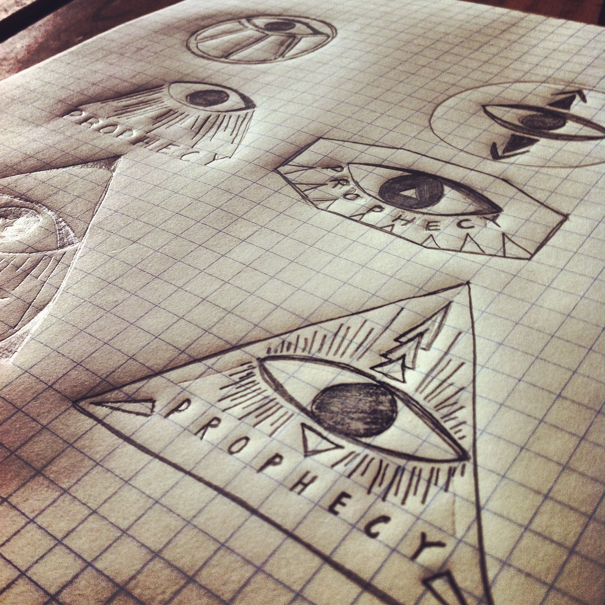
I started with an icon for the prophecy cards. It needs to be something big and immediately recognizable, to signal to the player that it’s time for them to take an action. For awhile I didn’t want to use the classic ‘all seeing eye’ imagery, but in the end that won out… In a post apocalyptic environment with a reset in human culture, I’d imagine that an eye would be a powerful symbol of future forecasting. To add to that the imagery is already on all American money, so I’d also imagine the future humans would find it and ascribe some sort of meaning to it. I did jazz it up a bit with some directional arrows though.

prophecy sketches

The symbol in the bottom right won out.

Next I worked on incorporating the symbol into a card layout, just to get a feel for what might be surrounding it. I’d like to use simple symbols to represent the prophecy written out on the card. It’s not imperative to gameplay, but it’s fun and reinforces the idea that most of these super vague prophecies are…well, super vague and ascribable to most major events if you try hard enough. To pull from renaissance art/vintage tarot cards, we’ll keep the coloring a little pale. For now.

prophecy card sketch

Despite the fact that the colored pencils make it look like a kindergartner colored this in, I think it’s a good start. You’ll have to excuse my lack of proper artist drawing tools; we’ve just moved and our stuff is still in transit. I didn’t want to shell out the big bucks for fancy markers.

I did finally get Illustrator up and working, so here’s a quick idea of what the prophecy symbol might look like done properly:

prophecy icon

I’d also like to take a moment to mention that we’ve been hash-tagging all over the internets with #cramgames. So if you’re on Twitter or Instagram that’s another way you can keep up with us.

That’s all for now from the art department!