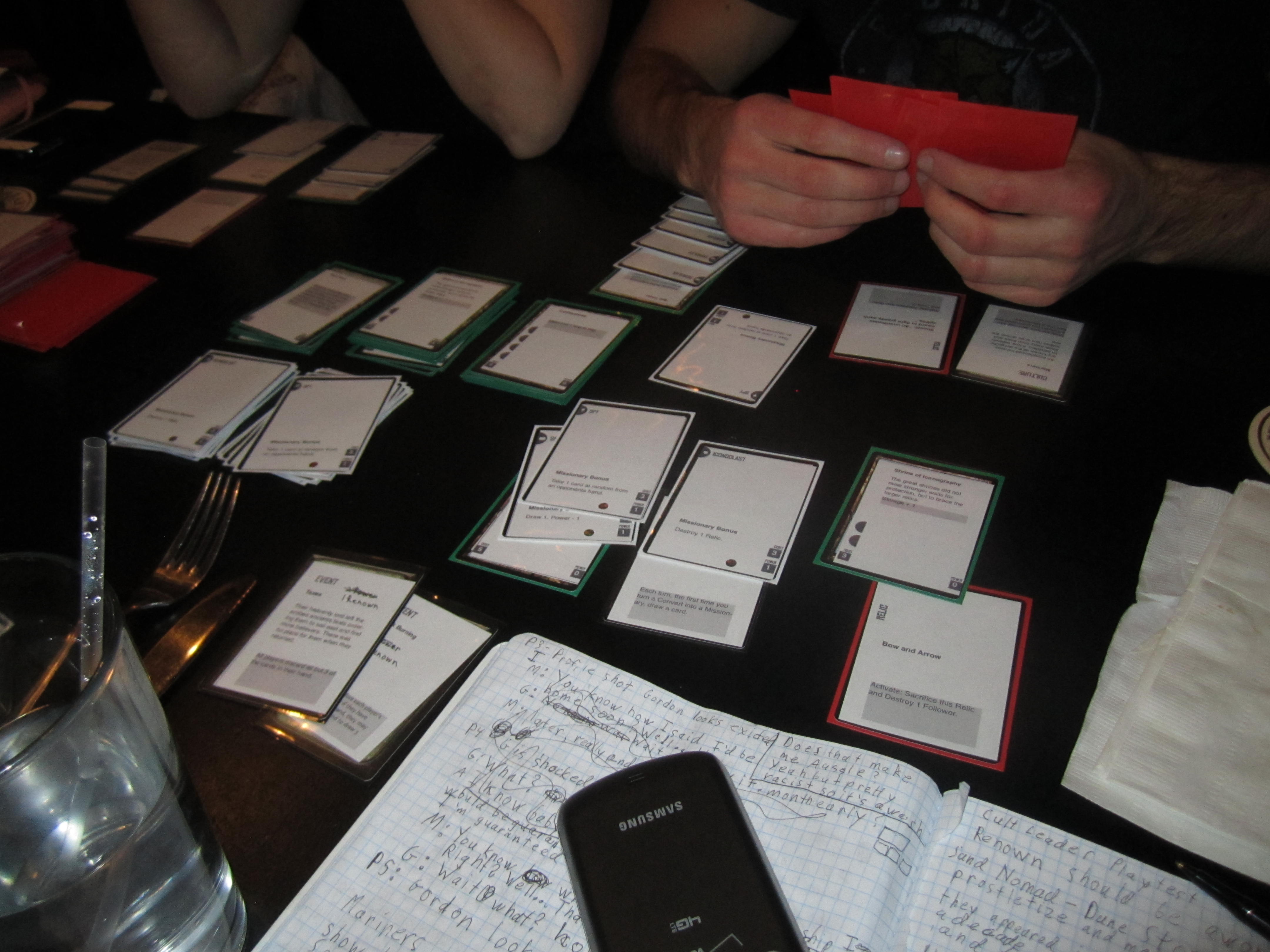
Prophecy Card Art
Hi everyone! I am finally introducing myself – I’m the graphic designer/artist for Cram Games. I’ve been working with Phil since the inception of this project, and I’m really happy to be able to show you what we have so far in terms of art. This is a really exciting project to be illustrating, and I’m beyond psyched to see how it all turns out.
The graphic look and feel of this game has evolved a bit over the course of the past year. We started out wanting a retro 50’s style, which evolved to a sort of neo-art deco, which has now turned into a Mexican day of the dead/renaissance/Neolithic cave painting kind of deal. You know, just something simple… At our last play test, Phil and Jesus discussed modeling our Prophecy cards off of tarot cards. I’m really excited to be working on the prophecy cards, mostly because they’ll involve a sweet icon and some prophetic absolute jibberish that I get to illustrate.
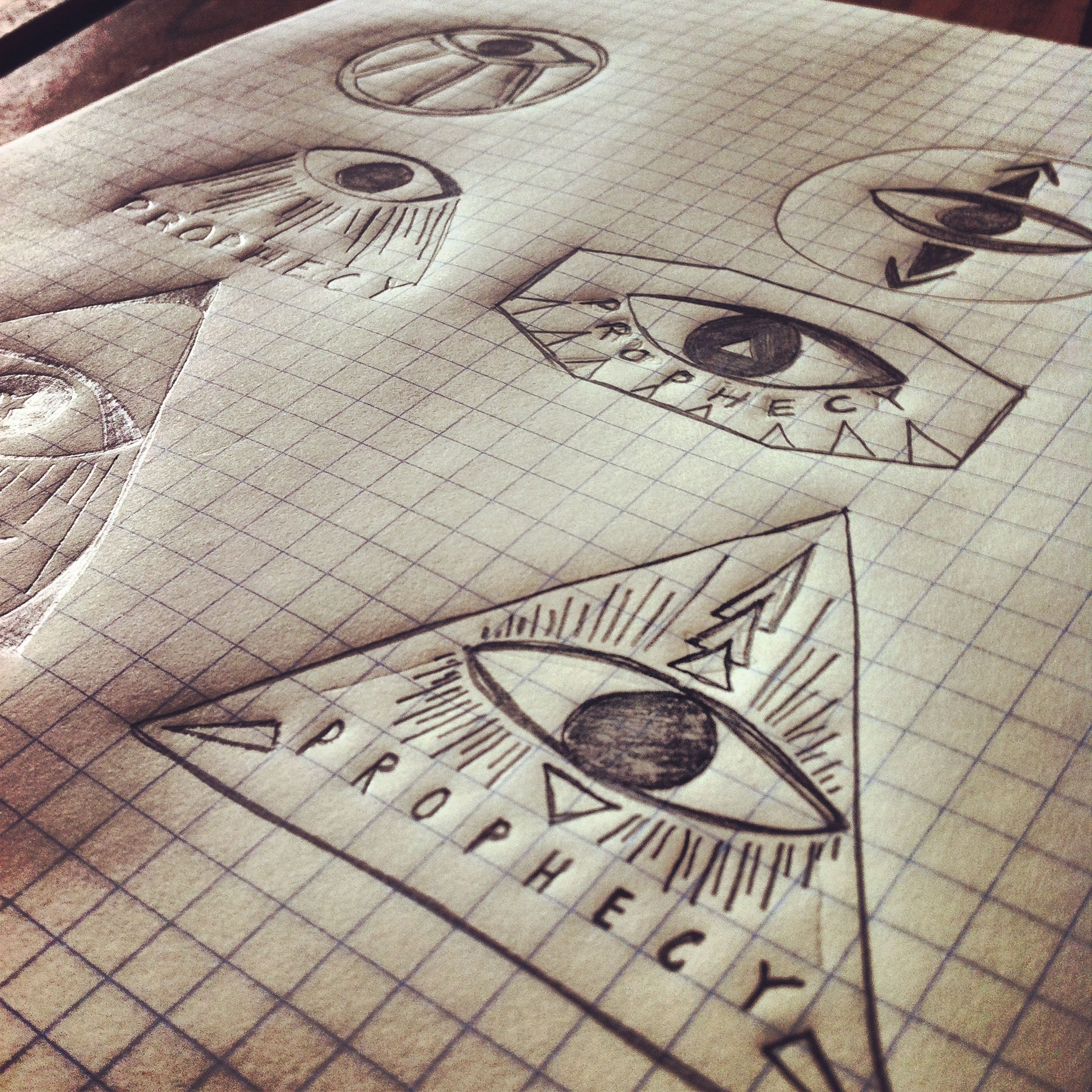
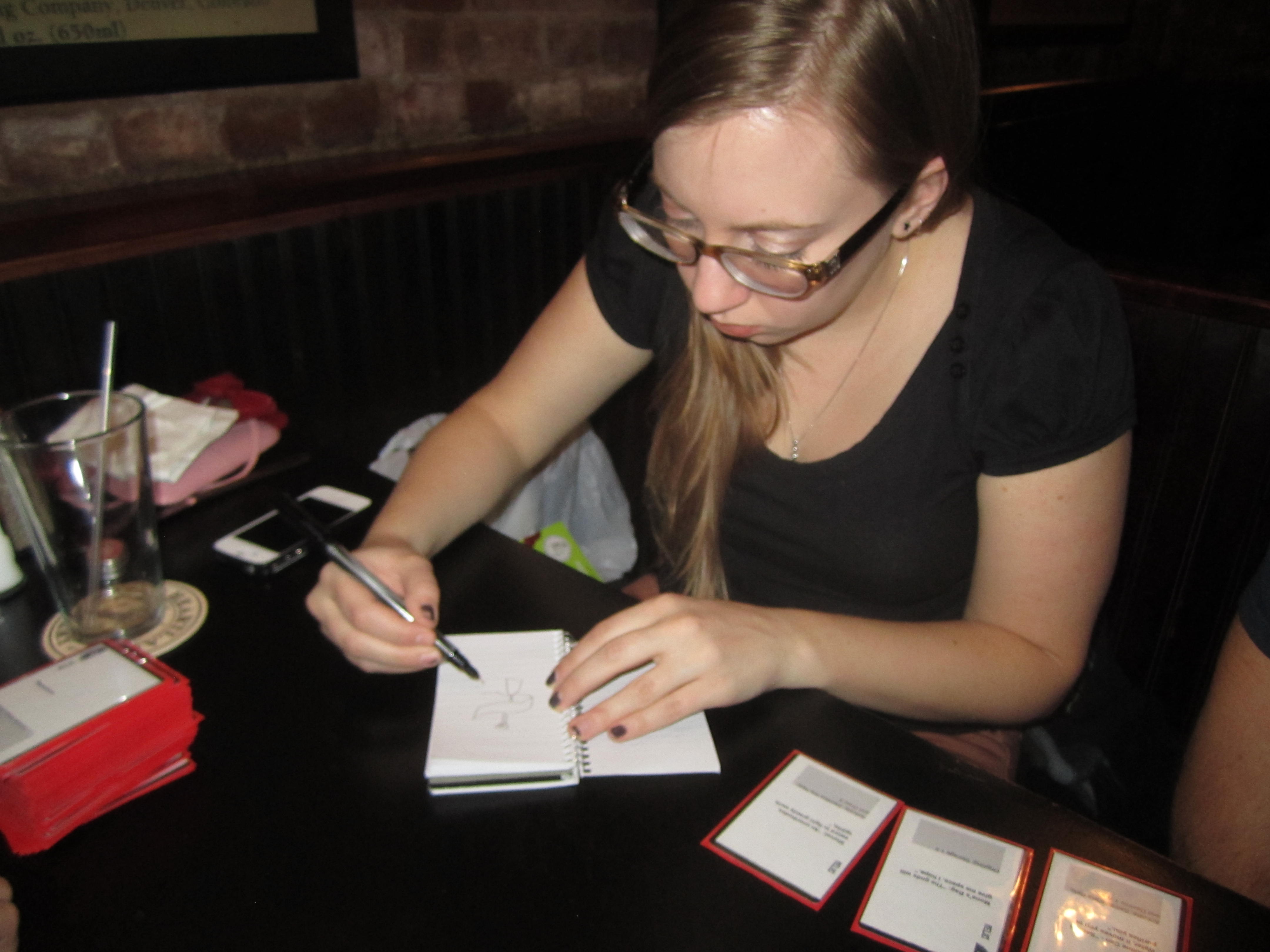
I started with an icon for the prophecy cards. It needs to be something big and immediately recognizable, to signal to the player that it’s time for them to take an action. For awhile I didn’t want to use the classic ‘all seeing eye’ imagery, but in the end that won out… In a post apocalyptic environment with a reset in human culture, I’d imagine that an eye would be a powerful symbol of future forecasting. To add to that the imagery is already on all American money, so I’d also imagine the future humans would find it and ascribe some sort of meaning to it. I did jazz it up a bit with some directional arrows though.
The symbol in the bottom right won out.
Next I worked on incorporating the symbol into a card layout, just to get a feel for what might be surrounding it. I’d like to use simple symbols to represent the prophecy written out on the card. It’s not imperative to gameplay, but it’s fun and reinforces the idea that most of these super vague prophecies are…well, super vague and ascribable to most major events if you try hard enough. To pull from renaissance art/vintage tarot cards, we’ll keep the coloring a little pale. For now.
Despite the fact that the colored pencils make it look like a kindergartner colored this in, I think it’s a good start. You’ll have to excuse my lack of proper artist drawing tools; we’ve just moved and our stuff is still in transit. I didn’t want to shell out the big bucks for fancy markers.
I did finally get Illustrator up and working, so here’s a quick idea of what the prophecy symbol might look like done properly:
I’d also like to take a moment to mention that we’ve been hash-tagging all over the internets with #cramgames. So if you’re on Twitter or Instagram that’s another way you can keep up with us.
That’s all for now from the art department!

